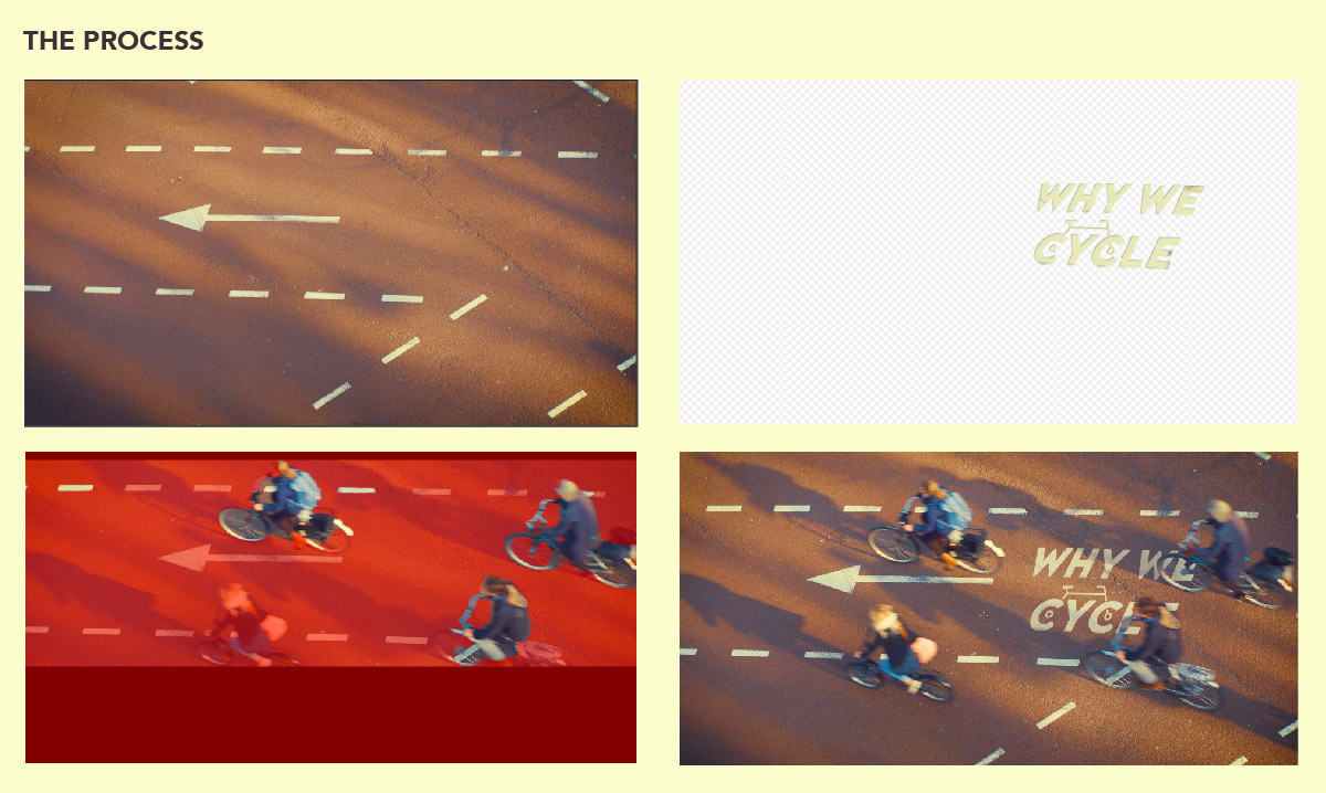
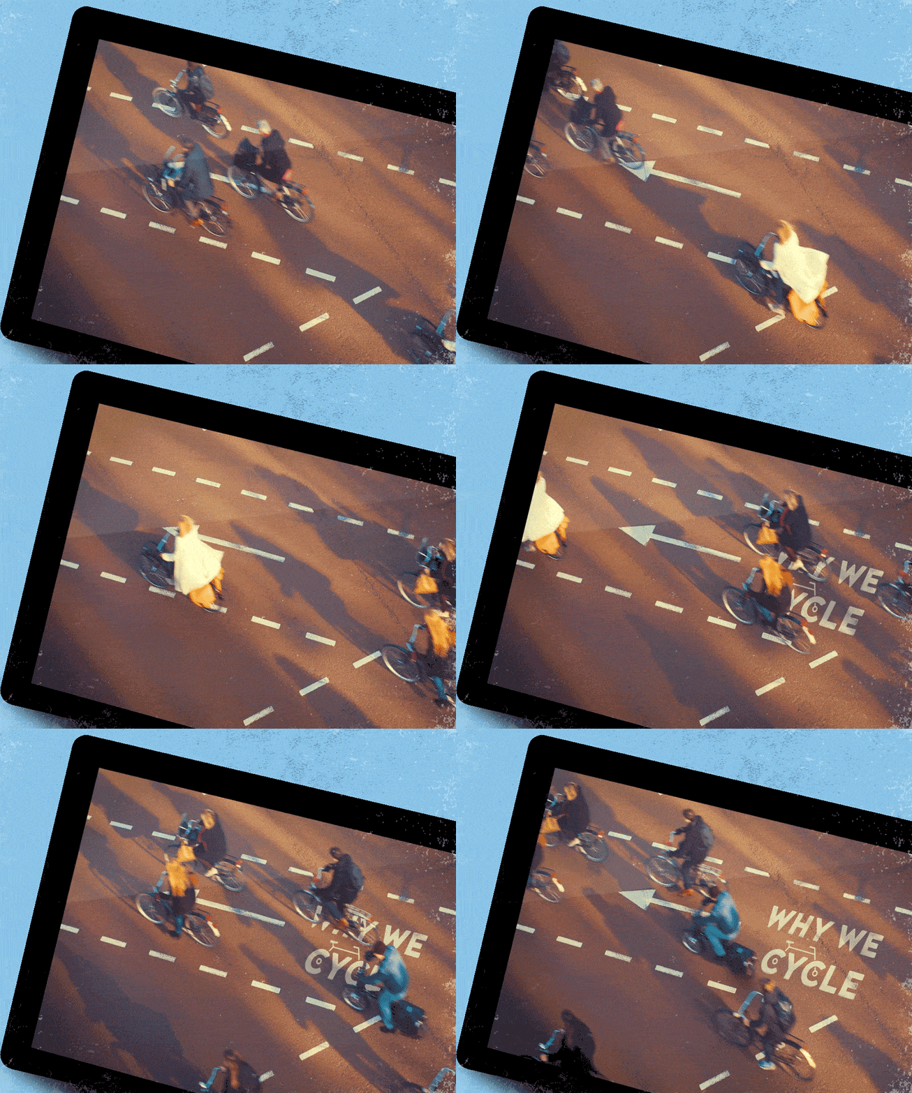
Arne Gielen and Gertjan Hulster from the production company, Nieuw en Verbeterd, contacted me to animate an opening title for their documentary about the cycling culture in the Netherlands. Working with the talented designer, Riccardo Russomanno, an art direction was developed and a series of font styles were made into an hierarchy. From here, I rotoscoped footage of a group of cyclists as they crossed a red bike path and then added the logo along with texture elements to make it appear weathered and as if it had been painted in place. I also animated maps to show patterns of cyclist movement throughout cities.


